

Matheus Leite
FULL APP. EMPTY PITCH.
I redesigned the website of MedCode, a Brazilian clinical decision app for doctors.
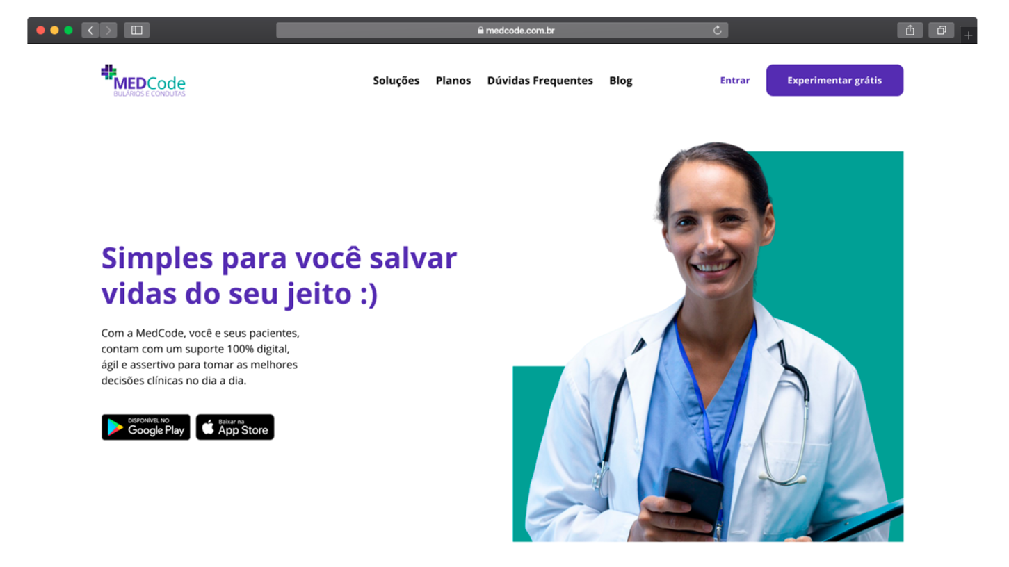
01. THE SITUATIONMedCode is a Brazilian app for doctors, residents and medical students. It puts drug information, treatment protocols, calculators and video lessons in one place, so a doctor can check a decision in seconds, often in the middle of a shift. People paid for it by subscription, after a free trial.
In July 2020, one of the founders reached out with a clear brief: the website was hurting the business. The app was being restructured too, but the team needed to grow in the market first, so the site came first. I took the project as a freelancer, on my own, in a five-week plan with a check-in with the founders every Friday.
I DESIGNED A SITE THAT TOLD YOUNG DOCTORS WHY TO CHOOSE MEDCODE, AND MADE IT EASY TO SUBSCRIBE.
"Today the site is bad for conversion, and bad to look at. There's a lot to improve." – MedCode co-founder, July 2020 (translated from Portuguese)
02. THE CHALLENGE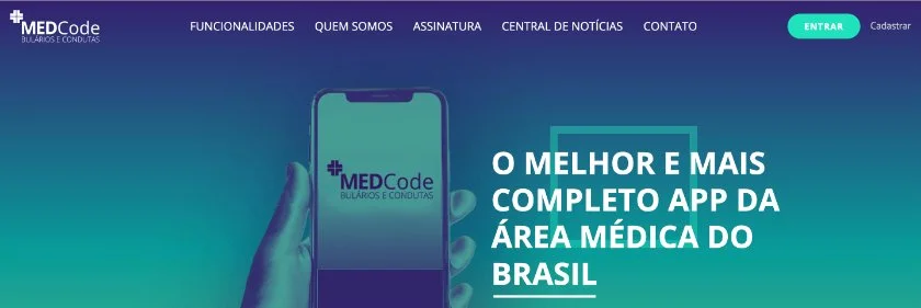
A KNOWN RIVAL. A CLEARER REASON.
MedCode's audience was mostly young doctors and medical students, people who often felt unsure of their clinical decisions. Most of them already knew Whitebook, the market leader, which had been around longer. The founders had two goals: more subscribers, and a clearer reason to choose MedCode over Whitebook. The website was where that choice was made, and it wasn't making the case.
The other limit was time. The founders worried about how long the developer would take, so they sent me ready-made templates as a starting point. I warned them a template might never look like MedCode. Their answer: if building from scratch is better, explain why. The site had to look like no one else and still be quick to build.
Original enough to stand out, simple enough to build fast.
03. THE JOURNEYDISCOVERY
Learning about doctors from doctors, without meeting anyone.
FROM SCRATCH
A new site inside an existing brand, small enough to build fast.
OUTCOME
Why MedCode, which plan, and how to start.
DISCOVERYASK THE PEOPLE WHO KNOW THE PATIENT AND THE PRODUCT.
This was mid-2020. Meeting in person was out, and the founders were practicing doctors with little free time. So I took the whole first phase online and asynchronous.
QUESTIONS THEY COULD ANSWER BETWEEN SHIFTS: I sent the six founders and partners a form in Google Drive about the problem MedCode solves, its users, its competitors and the feedback customers gave. Each person answered when they could. I then laid every answer out in Miro, one color per person, to see where they agreed and where they didn't.
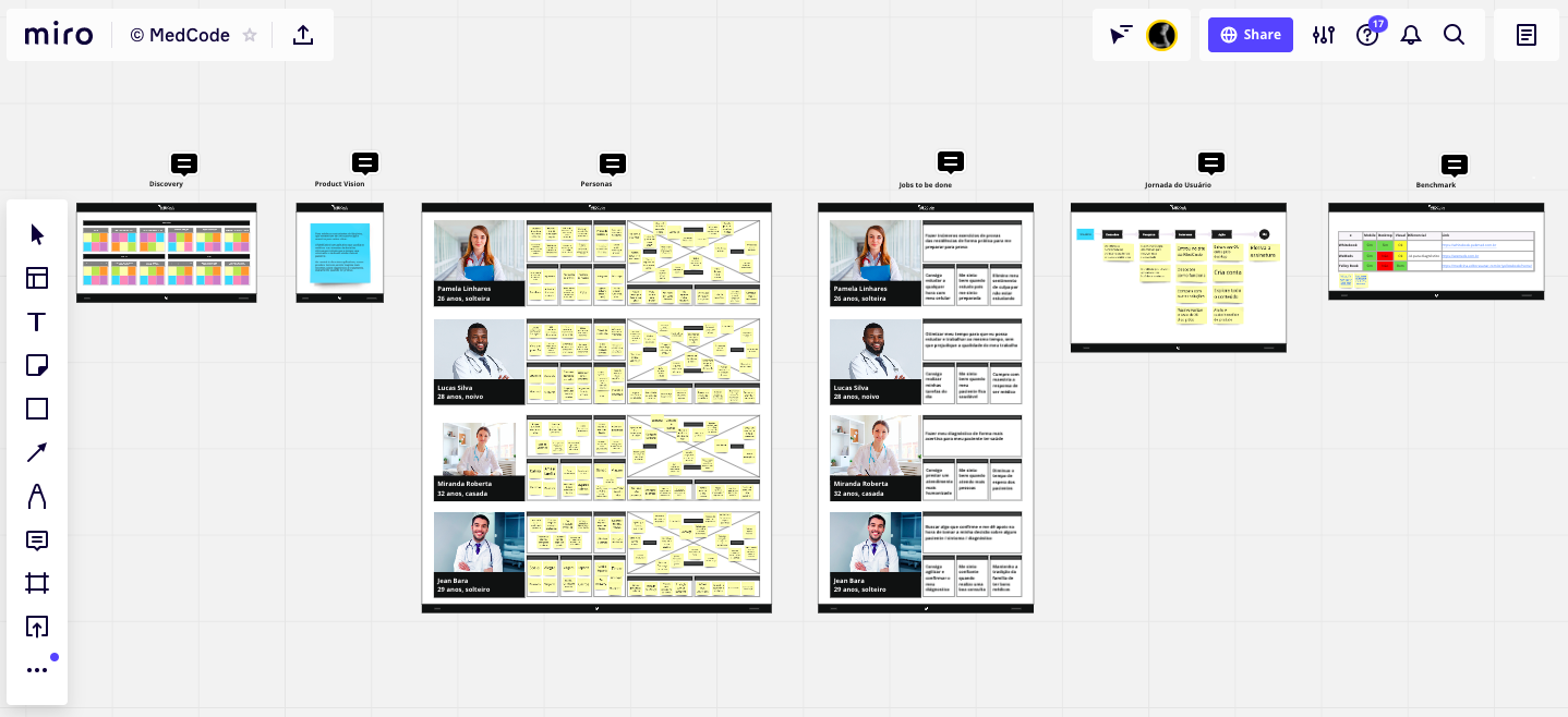
Six people, one question at a time, side by side.
The answers lined up on one point. The audience was young doctors, and their problem was insecurity: inexperience made every decision feel risky. Several of them named Whitebook as the main competitor, and the founders saw MedCode's edge in quality at a fair price, with content written by doctors working on the front line. That turned "make a better site" into a sharper job: show a young doctor, in one visit, why MedCode instead of the app they already knew.
FROM A GOOGLE SEARCH TO A SUBSCRIPTION: I mapped how a doctor reaches a subscription: they notice they need to save time, search Google, find apps like MedCode, compare them, try it free, and then decide if it's worth paying. I built the sitemap and the order of the homepage around that path.
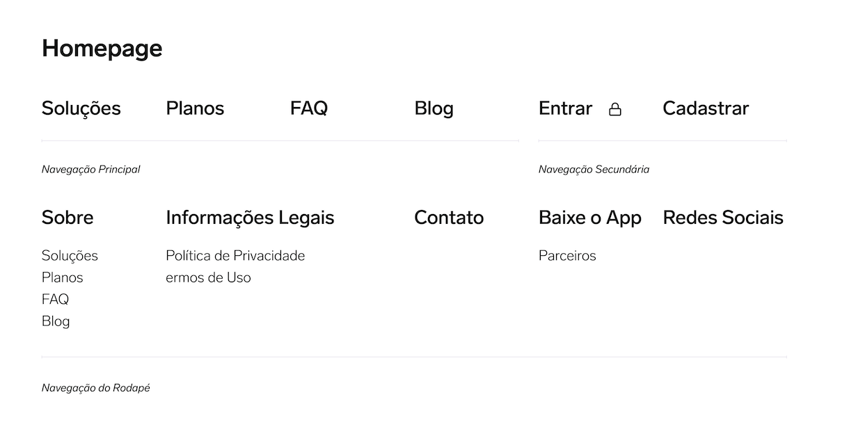
The site was designed backwards from the moment someone pays.
NO TEMPLATE. NO DELAY.
FROM SCRATCHThe brand already existed: the purple and green, the logo, the friendly tone. What didn't exist was a site that used it well. I chose to design the layout and components from scratch instead of dressing a template in MedCode's colors, and I answered the founders' worry with the same thing they cared about: build time.
ORIGINAL, BUT CHEAP TO BUILD: I kept the system small on purpose: one grid, a short set of reusable components, and specs written for the developer. The site looked like MedCode and not like a template, without adding the weeks the founders were afraid of.
It was mid-2020. I proposed offering 30 days free to doctors on the front line of COVID, and putting it in a banner at the very top, before anything else on the page.

First version: the product.
My first hero showed the app itself. In a later round I swapped it for a doctor holding a phone, betting a face would earn more trust. That version went live; this one shows where I started.
Eleven areas, one component.
The icons copy the app’s own home screen, so doctors recognize it after downloading. For the developer, it was one block repeated eleven times.
Prices: theirs. Emphasis: mine.
The founders set the prices and the 30-day trial. I chose which plan to push: the annual one, for subscribers who stay a year, not a month.
The comparison, answered first.
Most visitors already knew Whitebook. Four reasons, in the order a doctor would ask: any device, content by doctors, works offline, never miss an update.
Other doctors say it better.
Real store reviews. Several talk about price, the edge the founders wanted to stand out.
Objections before the click.
Can I trust the content? Is it for my specialty? How am I billed? The page answers them, then ends where every section points: try it free for 30 days.
The sitemap, kept.
The footer repeats the structure mapped in discovery, so nothing is more than one click away.
OUTCOME
ONE SITE. ONE CLEAR CHOICE.
Discovery, design and handoff in mid-2020, on a five-week plan.
templates used: a site designed from scratch inside the existing brand
0
plans on the page, with one clear recommendation: the annual plan
3 → 1
projects with MedCode: after the website, they hired me to redesign the entire app and portal
1 → 2
The site went live in 2020. I never received conversion data, so these numbers show what the design changed, not what it sold.
04. WHAT I LEARNEDWHAT A FIVE-WEEK WEBSITE TAUGHT ME, AND HOW I WORK DIFFERENTLY BECAUSE OF IT.
01.
TEST THE BET BEFORE YOU HAND IT OVER.
Swapping the app for a doctor in the hero was my biggest call, and it went to the developer untested. The tests were in my plan and never happened. Now I protect at least one quick test, even five doctors on a video call, for any change I’m making on instinct.
02.
AGREE ON THE METRIC ON DAY ONE.
The whole brief was about conversion, and I still finished without a single number to show for it. Today I agree at the start how we’ll measure success, and I ask for the data a few months after launch.
03.
DISAGREE USING THEIR ARGUMENT.
The founders wanted templates because they feared the build would drag. Designing from scratch only worked because I answered that fear directly, with a small system and clear specs. When I push back now, I start from the client’s concern, not from my taste.
05. WHERE IT STANDSTHE SITE DID ITS JOB. THEN THE COMPANY OUTGREW IT.
The website went live in 2020, and the founders came back to me to redesign the app.
MedCode kept growing. Today it says it serves more than 60,000 health professionals, has added an AI assistant, and runs a new website built by another team. That growth isn’t mine to claim. The site I designed was its storefront in 2020.
None of it happened alone. Thank you to:
The MedCode founders and teams, who answered every question between shifts and built what we designed.
This case reflects my personal experience as a freelance product designer for MedCode. It does not represent the views of MedCode. Content has been simplified, and confidential information has been removed.
