
Matheus Leite

THE MENU WAS AN ORG CHART. I TURNED IT INTO A PROFILE.
I redesigned the profile area of Cofidis Portugal's online banking around how customers think about their data, from the first card sort to the last developer handoff.
01. THE SITUATIONCofidis Portugal is a consumer credit company, and Cofinet is the online banking area where its Portuguese customers manage their credit, cards and personal data. In late 2022, the profile area was costing the company twice. Customers called, wrote and emailed support to change data they should have been able to change on their own. And outdated data meant Cofidis couldn't offer each customer the right products.
Cofidis had decided to rebuild Cofinet starting with the features customers used most, and the redesign started with the profile. I had just moved from the company's experimentation LAB, where I worked on new business models outside the core, into the Homebanking team as Product Designer Lead. This was my first project with them.
I REBUILT THE PROFILE AROUND THE CUSTOMER'S LOGIC, SO PEOPLE COULD UPDATE THEIR OWN DATA WITHOUT CALLING THE BANK.
Five menu items for what customers saw as one thing: their data.

02. THE CHALLENGE
NOTHING COULD BREAK. EVERYTHING HAD TO CHANGE.
The profile mirrored the company, not the customer. Personal data, professional data, password, help and contacts each had their own menu item and page, because different teams owned them. Customers saw one thing: their data. And they only came to the profile when something was urgent, so every extra click cost a call to support.
The change had to happen inside a regulated, live product, where a broken screen means a customer who can’t reach their credit. Some teams were used to the old layout and saw no reason to change it. I came from Cofidis’ own experimentation LAB, where we were allowed to break things. Here, I had to find a way to change a lot without breaking anything.
LAB habits, bank rules: moving fast inside a product that can’t stop.
03. THE JOURNEYDISCOVERY
How customers group their own data, and why they come to the profile.
CO-CREATION
Six areas, four questions and one new structure.
DELIVERY
Badges, OCR, a lighter header and a change shipped in versions.
DISCOVERYASK CUSTOMERS BEFORE YOU ARRANGE ANYTHING.
My first assumption was that the problem was structure: customers couldn't find things because of how the menu was organised. Instead of redrawing the menu myself, I asked customers to draw it.
I used two methods and no more: a card sort to see how people group their data, and interviews to understand why and when they open the profile.
“It’s not: I want to achieve this, so I go to Cofinet. No. For urgent things.”
LET CUSTOMERS DRAW THE MENU: I gave customers the profile’s content on cards and asked them to group it their way. Few finished, so I treated the result as direction, not proof.
WHAT GOES TOGETHER: The line our menu was built on didn’t exist in customers’ heads. Personal and professional data were, to them, simply their data. Field by field, they drew a different line: who they are on one side (tax number, ID, mobile), their money on the other (profession, salary, rent, expenses).
Alongside the card sort, I interviewed customers about the last time they opened the profile. One answer shaped everything: they only come when something is urgent. A profile people visit a few times a year has to make sense at first sight.
The card sort showed where the structure broke. The interviews showed what that cost people in practice.
83% grouped personal and professional data together. 71% put Help outside the profile.
FOUR PAINS:
The same data appeared in more than one place;
Updating anything took too many steps;
The categories didn’t match the customer’s logic;
And there was no way to know if the profile was complete or if an update had gone through.
CO-CREATIONDESIGN WITH THE PEOPLE WHO LIVE WITH IT.
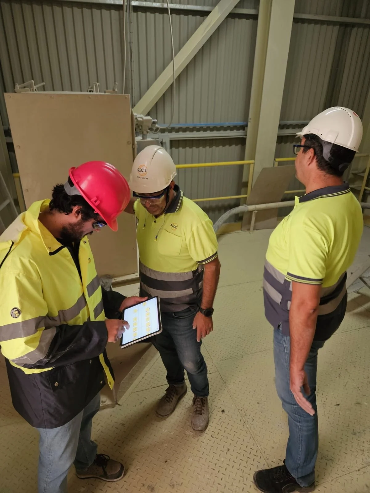
I could have presented finished screens to the rest of the company. I chose to design the profile with them instead, because the people who answer the phone and maintain the systems knew things no card sort would show.
Six areas of the company sketched the profile before it had a single screen.
HOW MIGHT WE:
Four pains, four questions
Before anyone drew a screen, I turned each pain from the research into a question the team could design for. The questions set the brief, and the sketches answered them.
-
What we heard: the same data appeared in more than one place, and customers didn’t know which one was right.
What it became: one profile screen, where each piece of data lives in only one place. -
What we heard: updating anything meant several pages and too many clicks.
What it became: customers upload a document and OCR fills in the fields. -
What we heard: the menu split personal and professional data, but 83% of customers grouped them together.
What it became: three sections that match the groups customers made. -
What we heard: customers had no way to know if their data was complete or if an update had gone through.
What it became: a status badge on each section and the date of the last update.
Two ideas from this table went all the way to launch: status badges and filling in data from a document.
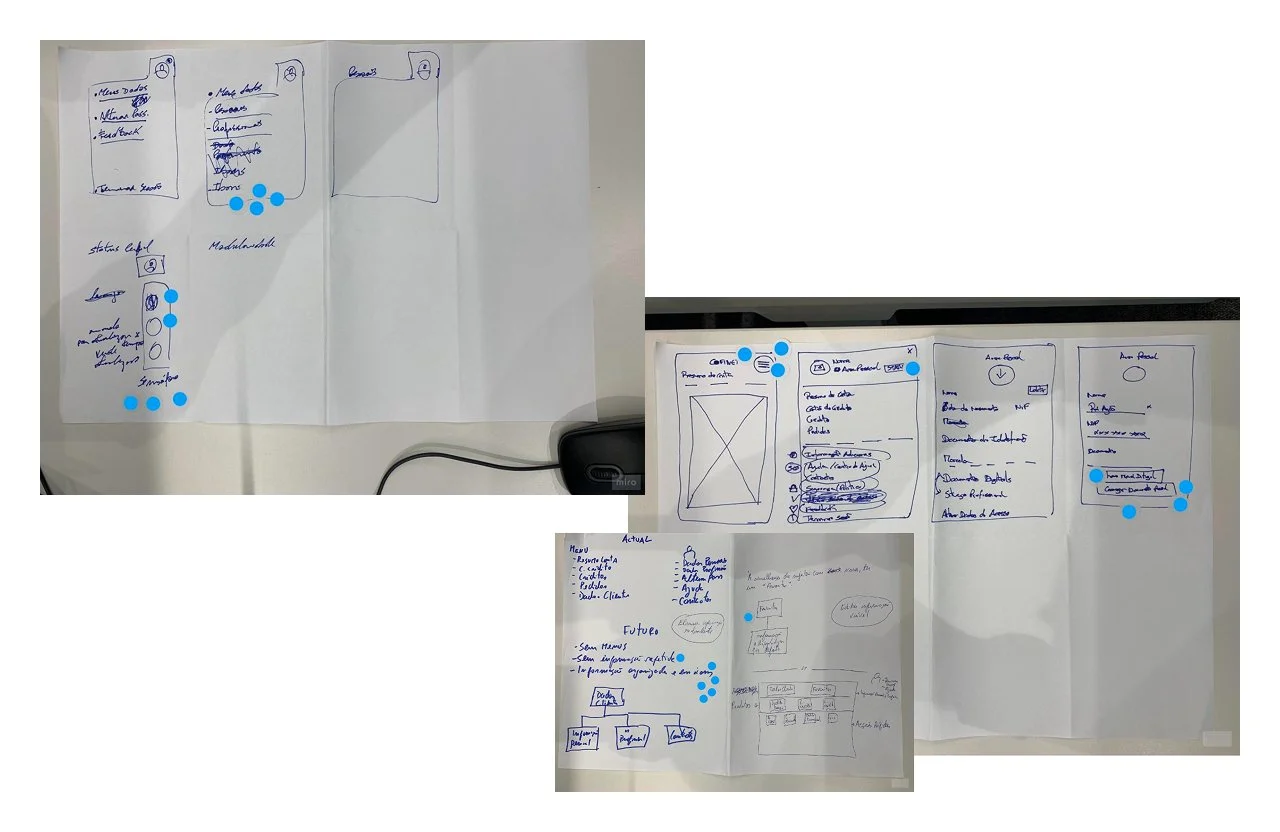
Developers, data, the product owner, QA, customer support and architecture sketched with me, in groups and at home. Support brought the requests that filled their queue. Architecture brought what the systems allowed. Then everyone voted with dots on the ideas worth keeping.
The winning ideas met the card sort on one page. I merged five menu items into one screen with three sections, Personal data, Income and expenses, and Settings, and gave each one a status badge. Help moved to its own support area.
DESIGNED WITH
/
NOT FOR.
DELIVERYSHIP BIG CHANGES IN SMALL PIECES.
Cofinet couldn’t stop for a redesign, so nothing went live all at once. Every screen was designed for desktop and mobile, and every change was planned as a version the developers could build, test and release on its own. The customer never woke up to a new bank. They saw it change, one step at a time.
Every change planned as a version: build, test, release, repeat.
STATUS BADGES:
Show the status. Skip the call
Every section carries a badge, green when the data is verified and orange when something needs attention, next to the date of the last update. Customers know at a glance if everything is in order, without calling anyone. And Cofidis gets data it can actually use.
DOCUMENT READING (OCR):
let the document fill the form
Customers update their identity or address by uploading a document. OCR (software that reads text from an image) fills in the fields. The backoffice no longer checks every document by hand.
HEADER AND FOOTER:
less brand, more customer
Inside the client area, customers already know where they are. So I took the Cofidis logo out of the header to make the space feel personal, and kept it in the footer. Some areas pushed back because it had always been there. I built the case with the Product Manager and the Tech Lead first, and the three of us moved it forward together.
The header shipped in three versions, adding Support and then Notifications. The footer went from 7 links to 3.
HANDOFF: a handoff is a product too.
The developers were the users of this file. An overview page with owners and dates, a navigable index, scenarios, error states, versions matched to the build plan, and copy reviewed with the UX writer.
OUTCOME
FEWER PAGES. FEWER CALLS.
Research, design and handoff in 2023, then rollout in stages.
3 → 1
profile pages merged into one screen, organised the way customers group their data
6
7 → 3
links in the footer: less content duplicated across pages, and less to maintain with every release
areas of the company that designed the profile with me, from support to architecture
Everything designed shipped: the new profile, document updates through OCR, the status badges, the header, the footer and the support area. Each piece went live as its version was built.
04. WHAT I LEARNEDWHAT REDESIGNING A BANK’S PROFILE TAUGHT ME, AND HOW I WORK DIFFERENTLY BECAUSE OF IT.
01.
MENUS COPY ORG CHARTS.
The old menu split data the way the company’s teams split work. One card sort with 34 customers was enough to show it. When a structure doesn’t make sense to users, I now look for the team behind it first, and test the structure before I draw a single screen.
02.
BOLD IDEAS, SMALL VERSIONS.
At Cofidis’ LAB we could break things. In the live bank next door, we couldn’t, so I broke the change into versions instead. Even the contested logo change went out as one small, reversible step of the header, which made it easier to accept. That is how I now bring bold ideas into products that can’t stop.
03.
I SHIPPED IT AND NEVER MEASURED IT.
I started without a count of support calls and left before anyone measured the result. I know the work reached customers, but I can’t show what it changed. Today I agree the metrics and the starting point on day one, and name who will track them after launch.
05. WHERE IT STANDSTHE NEW COFINET STARTED WITH THIS PROFILE.
The profile, the header, the footer and the support area all reached customers, in stages, as each version was built.
I left Cofidis before the relaunch of the new online banking was finished.
None of it happened alone. Thank you to:
My Homebanking team at Cofidis Portugal, who took every decision with me, from the first sketch to the last release.
The Cofidis design community, for the reviews, the challenges and the shared standards.
Every customer who sorted cards, answered questions and tested the prototype.
#StillDay1
This case reflects my personal experience as Product Designer Lead at Cofidis Portugal. It does not represent the views of Cofidis. Content has been simplified, and confidential information has been removed or anonymised.
The first piece of a bigger rebuild.
